Small Letters Digitizing
In this blog, we’ll explore the intricacies of small letters digitizing and share tips on how to achieve clear, sharp results every time.
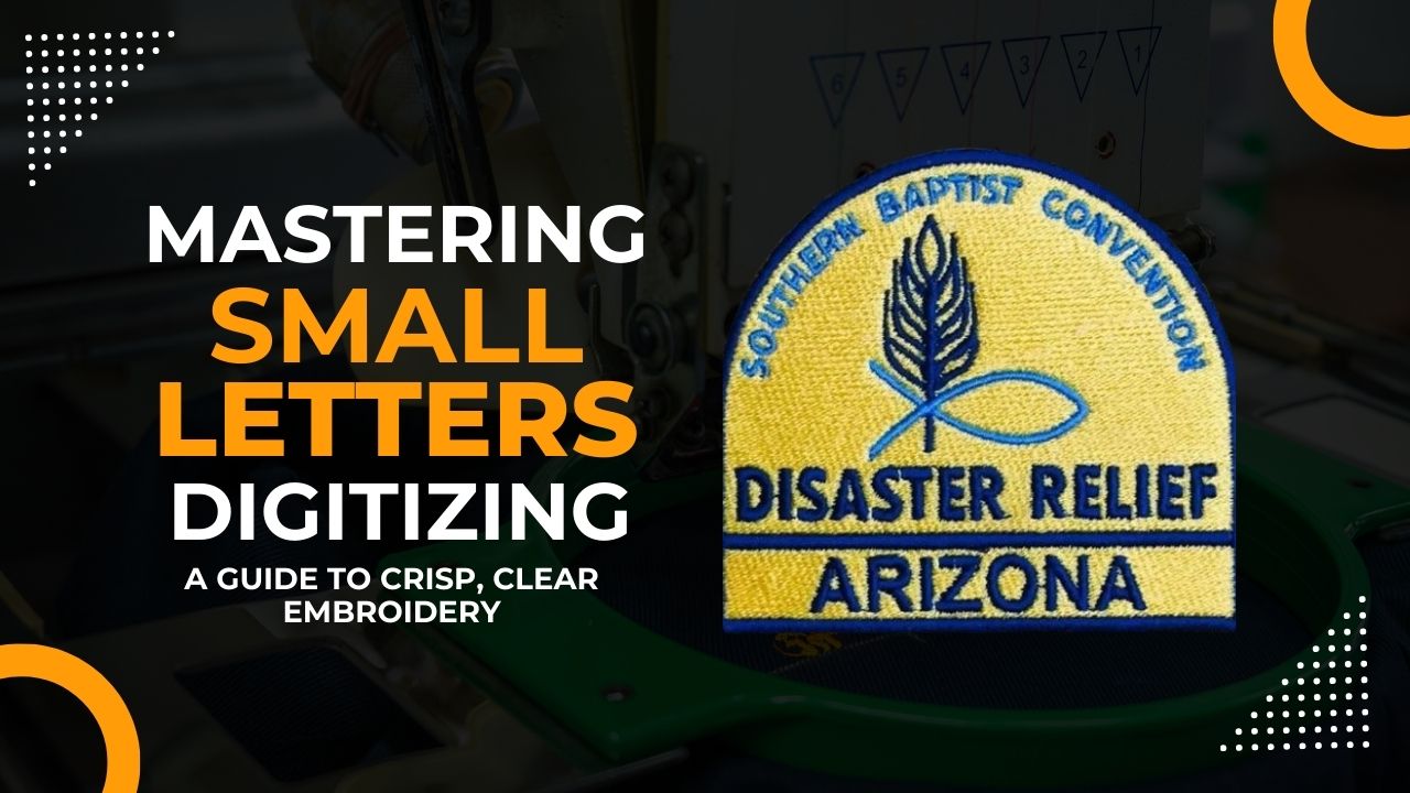
Mastering Small Letters Digitizing: A Guide to Crisp, Clear Embroidery
Embroidery has always been a fine art, blending creativity with precision. Among the many challenges that digitizers face, one stands out as particularly tricky: small letters. Whether it’s a company name, a slogan, or fine details on a design, small text requires a keen eye and expert skills to ensure readability and quality. In this blog, we’ll explore the intricacies of small letters digitizing and share tips on how to achieve clear, sharp results every time.
Understanding the Challenges of Small Lettering in Embroidery
Small letters in embroidery present a unique set of challenges. Unlike large designs, where stitches can easily follow curves and details, small letters demand precise control over stitch placement and density. The common issues with small lettering include:
- Blurring or bleeding: When letters are too small, stitches can overlap, causing the text to look blurry or indistinct.
- Pulling and distortion: Fabric tension can distort small letters, making them look uneven or stretched.
- Unreadable text: If not digitized correctly, small letters can become illegible, especially when using thicker threads or textured fabrics.
Key Factors in Successful Small Letter Digitizing
To achieve crisp, readable small letters, attention to detail in the digitizing process is crucial. Here are the key factors to consider:
1. Font Selection
The first step in small letter digitizing is choosing the right font. Not all fonts are suitable for embroidery, especially at small sizes. Serif fonts, with their fine details, often struggle at small scales. Instead, opt for clean, sans-serif fonts that have simple, bold shapes. Popular choices include Arial, Helvetica, and Verdana.
2. Minimum Letter Size
When it comes to small lettering, size matters. As a general rule, the smallest recommended letter height is 0.25 inches (6.4mm). Going smaller than this increases the risk of losing clarity. If smaller text is necessary, adjustments in stitch type and density will be required.
3. Stitch Type
For small letters, a satin stitch is typically the best choice. Satin stitches allow for smooth, continuous lines that can accommodate the curves and angles of letters. However, for very tiny text, a simple run stitch might be more effective. It’s essential to match the stitch type to the letter size for the best results.
4. Stitch Density
The density of the stitches needs to be carefully controlled. Too many stitches can cause puckering and blurring, while too few can leave gaps in the design. A balanced approach is to use a slightly lower density than usual for small letters, ensuring that the thread doesn’t bunch up.
5. Push and Pull Compensation
Fabric tension during embroidery can cause letters to pull inwards, distorting their shape. Proper push and pull compensation—where the digitizer anticipates and adjusts for this movement—ensures that letters retain their correct form. Adding extra width to columns or adjusting start and end points can counteract distortion.
6. Thread Type and Color
Thinner threads, such as 60-weight thread, are better suited for small letters than the standard 40-weight thread. These finer threads provide more detail and reduce bulk. Also, using contrasting colors between the text and the background enhances readability.
7. Underlay Stitches
Underlay stitches provide a foundation that stabilizes the fabric and supports the top stitching. For small letters, a simple center walk or edge walk underlay works best. It gives structure without adding unnecessary bulk.
Tips for Digitizing Small Letters
To achieve the best results with small letter digitizing, consider these tips:
- Test and Adjust: Always test your digitized design on the same fabric and under the same conditions as the final product. Make adjustments as needed to ensure clarity.
- Reduce Complexity: Simplify letters where possible. This might mean removing serifs, adjusting spacing, or straightening curves to make the text more legible.
- Mind the Fabric: Different fabrics interact with stitches in different ways. Softer fabrics may require additional stabilizers to prevent distortion, while stiffer fabrics might need less density.
Conclusion
Small letters digitizing is an art form that requires a deep understanding of embroidery techniques and attention to detail. By selecting the right font, adjusting stitch types and densities, and compensating for fabric behavior, you can achieve crisp, readable text even at tiny sizes. With practice and the right tools, mastering small letters digitizing can elevate the quality of your embroidery projects and open up new possibilities in design.
Invest time in learning these techniques, and soon, even the smallest details in your designs will stand out with clarity and precision.


